

To provide users with a functioning system or service hound for tracking and pertronizing nearby Artisans
Users who have recently moved to a neightbourhood usually find it difficult to locate and secure Artisans to render services to them since the system of finding arttisans operates on referrals
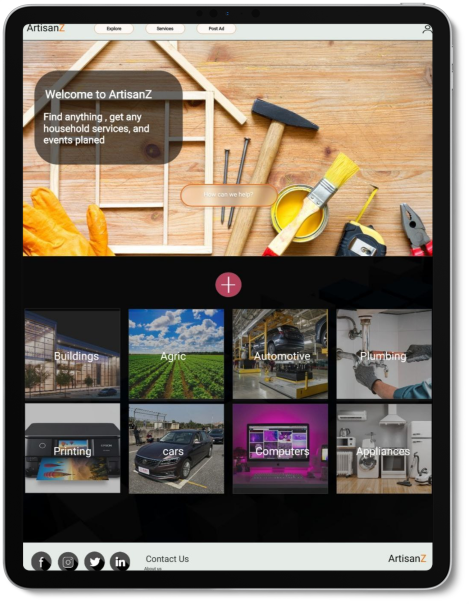
Starting off, I asked myself a few initial questions. Who is the primary user? What kind of goals do they have? Why would someone want to use this application? Just how large of a scope do I want this project to be? I conducted interviews at the initial stage of my research and created personas and empathy maps to understand the users I’m designing for and their needs. A primary user group identified through research were newly resident individuals in the Sakumono-Tema geographical area between the ages of 20 and 40 years.This user group confirmed initial assumptions about Artisanz’s customers, and their need for such a services tracking system
* Difficulty in locating artisans within in the Geographical area
* No medium to display or advertise skills and services.
* no detailed and doumented client attestations
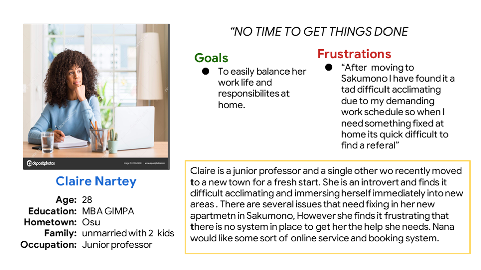
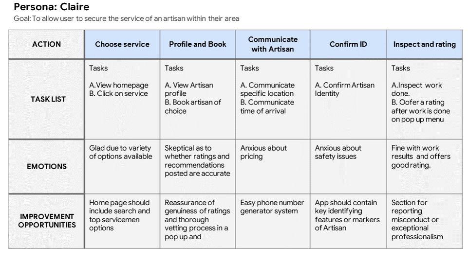
In order to fully empathize with the user I created a user journey map to simulate a user's/persona's userflow while interacting with Ardtisanz.
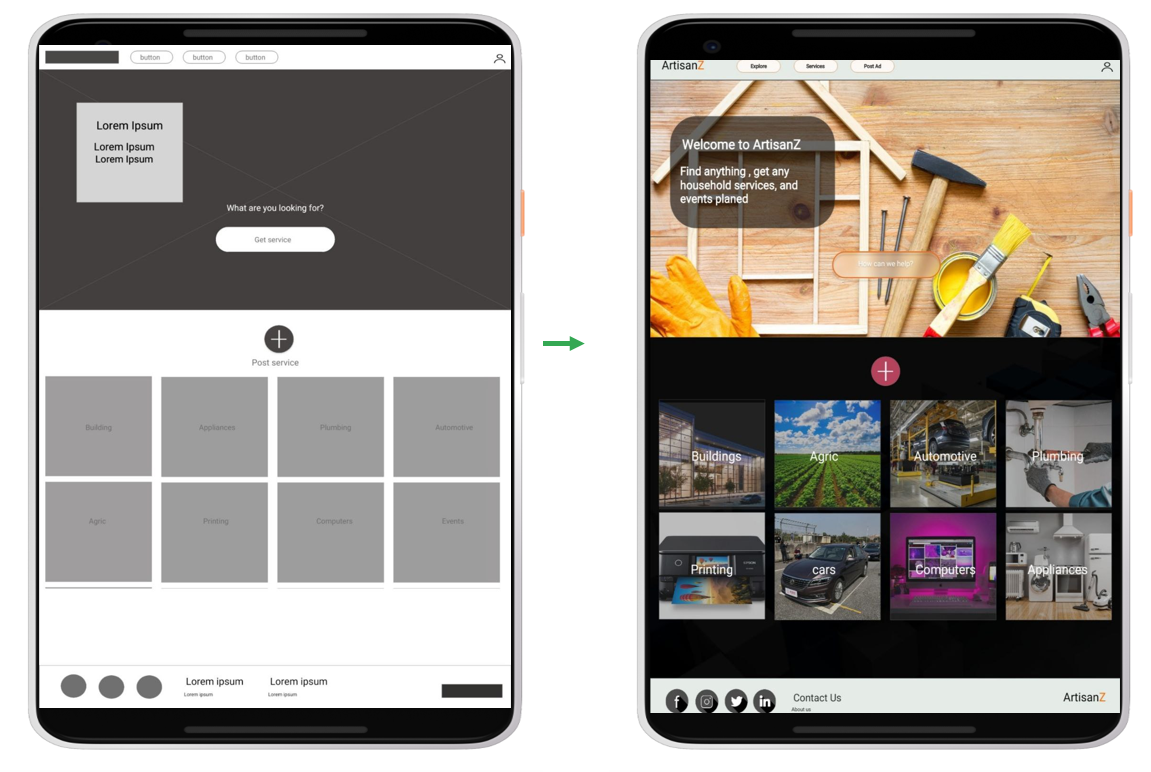
I carried out a quick ideation exercise to come up with ideas to enhance the flow and structure of the service system.Taking the time to draft iterations of each screen of the app on paper ensured that the elements that made it to digital wireframes would be well-suited to address user pain points. For the home screen, I prioritized a quick and booking process to help users save time
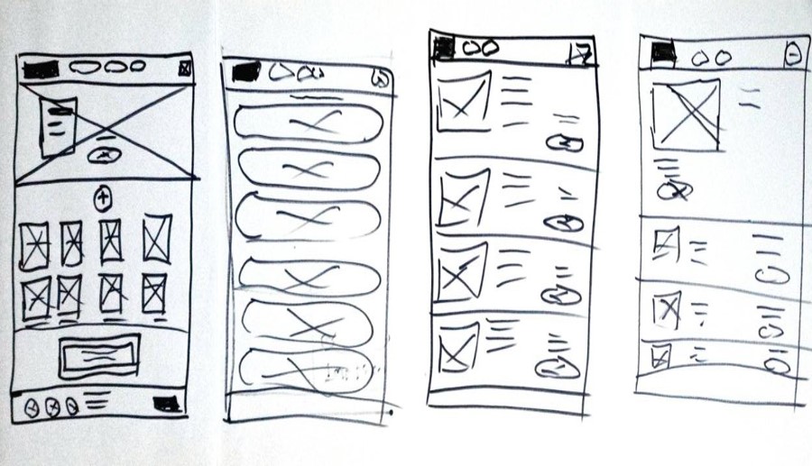
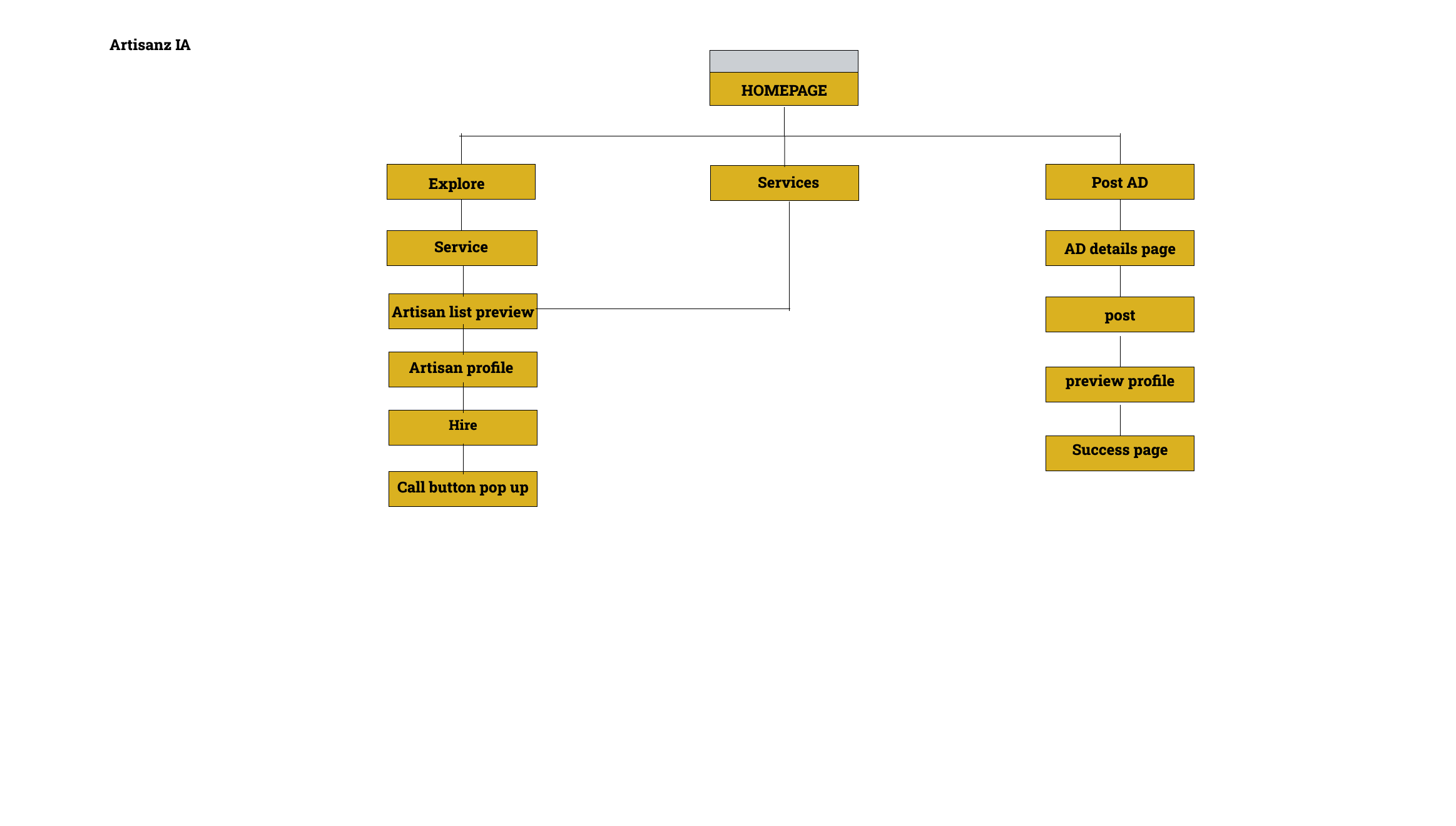
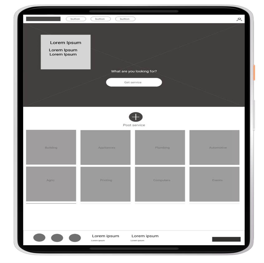
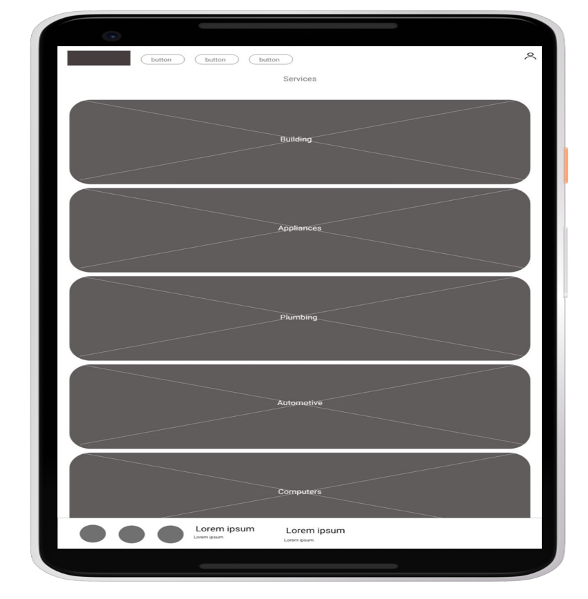
As the initial design phase continued, I made sure to base screen designs on feedback and findings from the user research as well as insights from user journey maps.
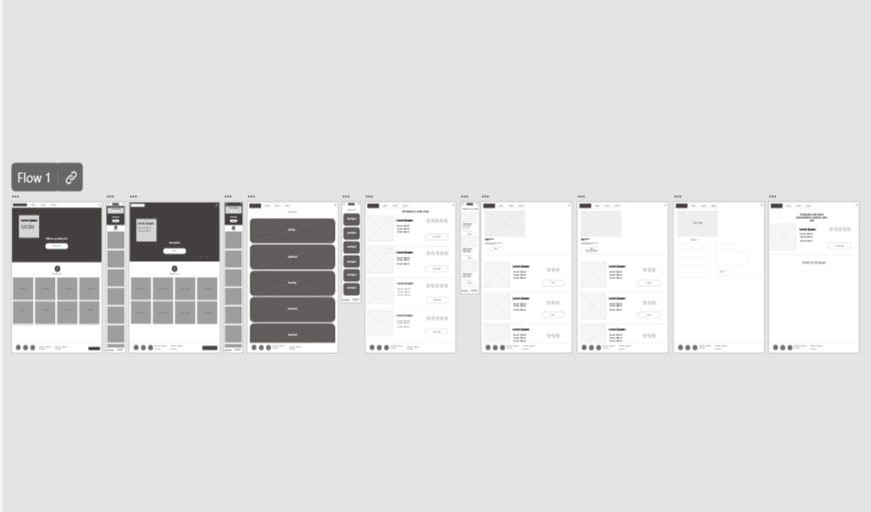
I conducted an unmoderated usability study which involved 6 participants who tested how easy it was to interact with the flow of the above wireframes.This helped to guide the designs transition for mere wireframes to mockups. The finding from the usability studies were:
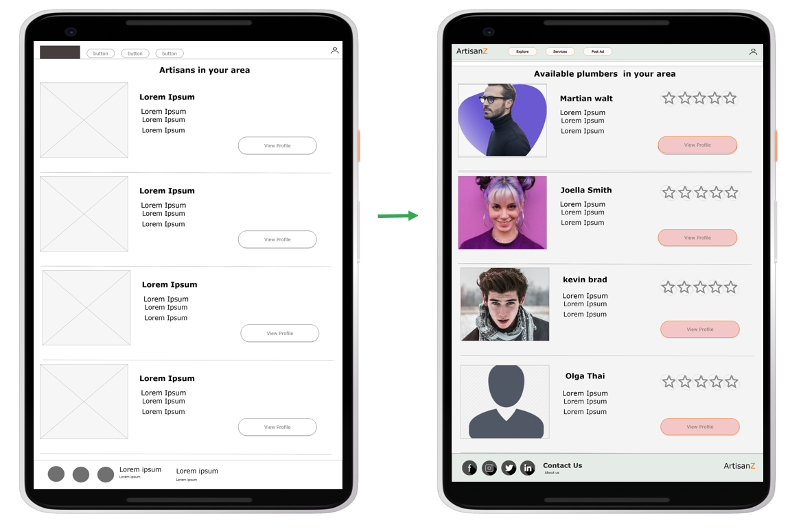
*Users want a compact yet detailed rating system to enable them to quickly make the best choice of artisan for their problem
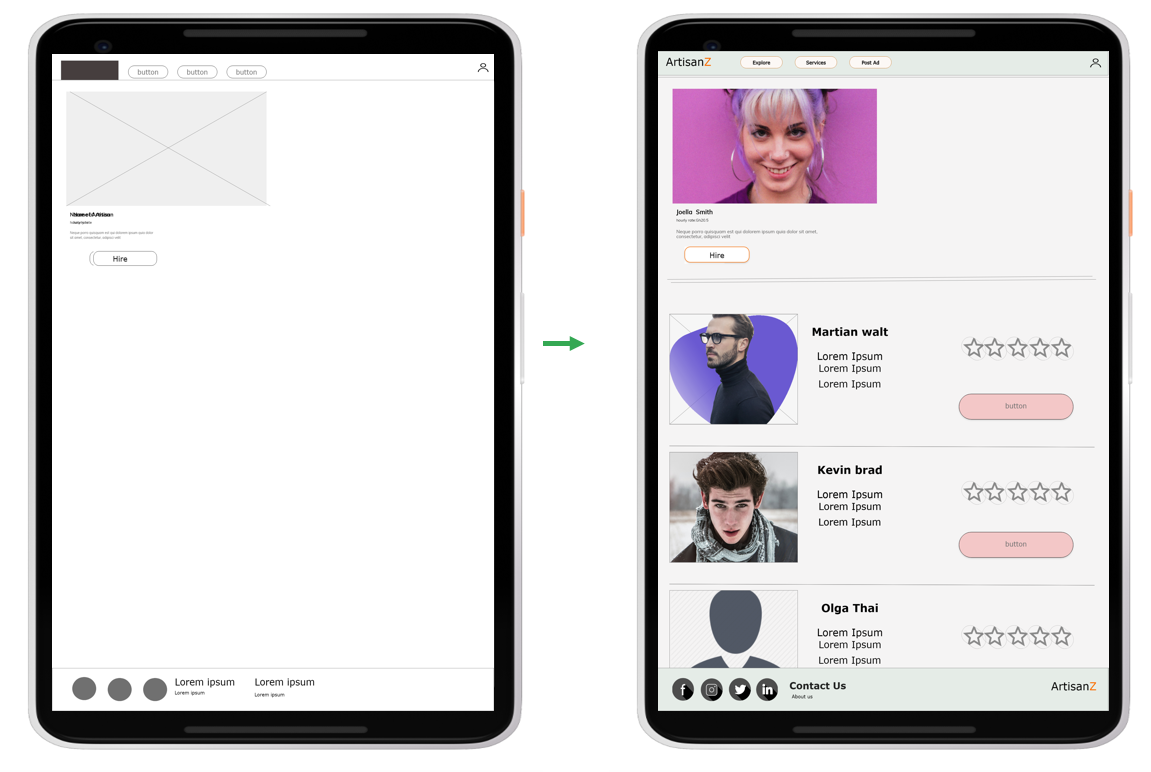
*Users want to be able to view a selected user profile at the same time having the option
to navigate to or review another user profile if the initially selected user isn't desirable
*Users want a call option as an alternate means of communication when hiring artisans
The usability study revealed that most users were in agreement with the layout of the simplistic nature of the Homepage, users however further emphasized the need to improve the app aesthetics Not much was changed
The usability study revealed that most users want to be able to view a selected user profile and at the same time have the option to navigate to or review another users profile if the initially selected user isn't desirable
The usability study revealed that most users want a call option.
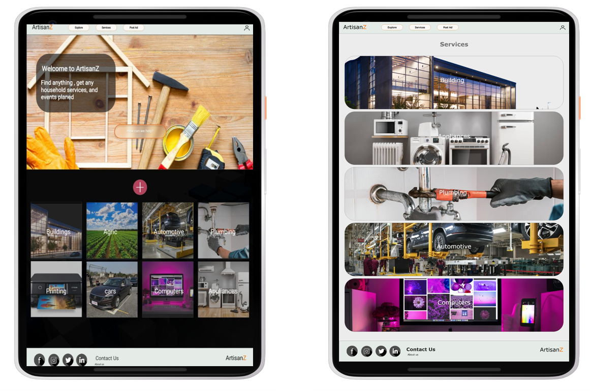
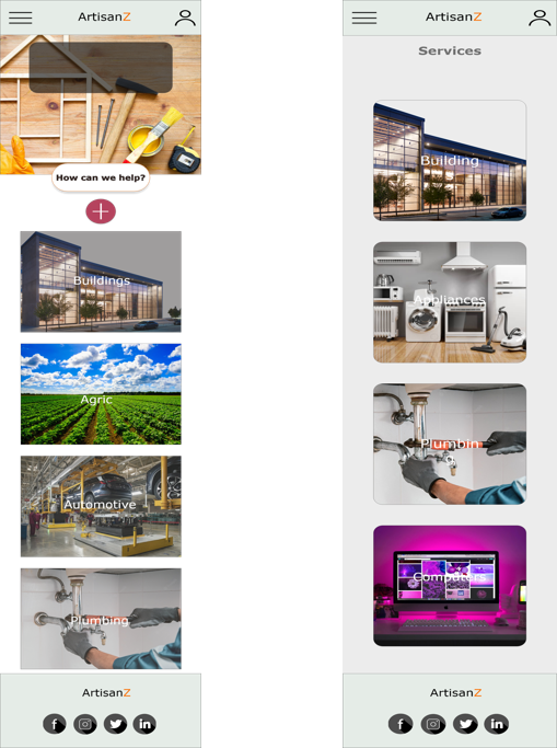
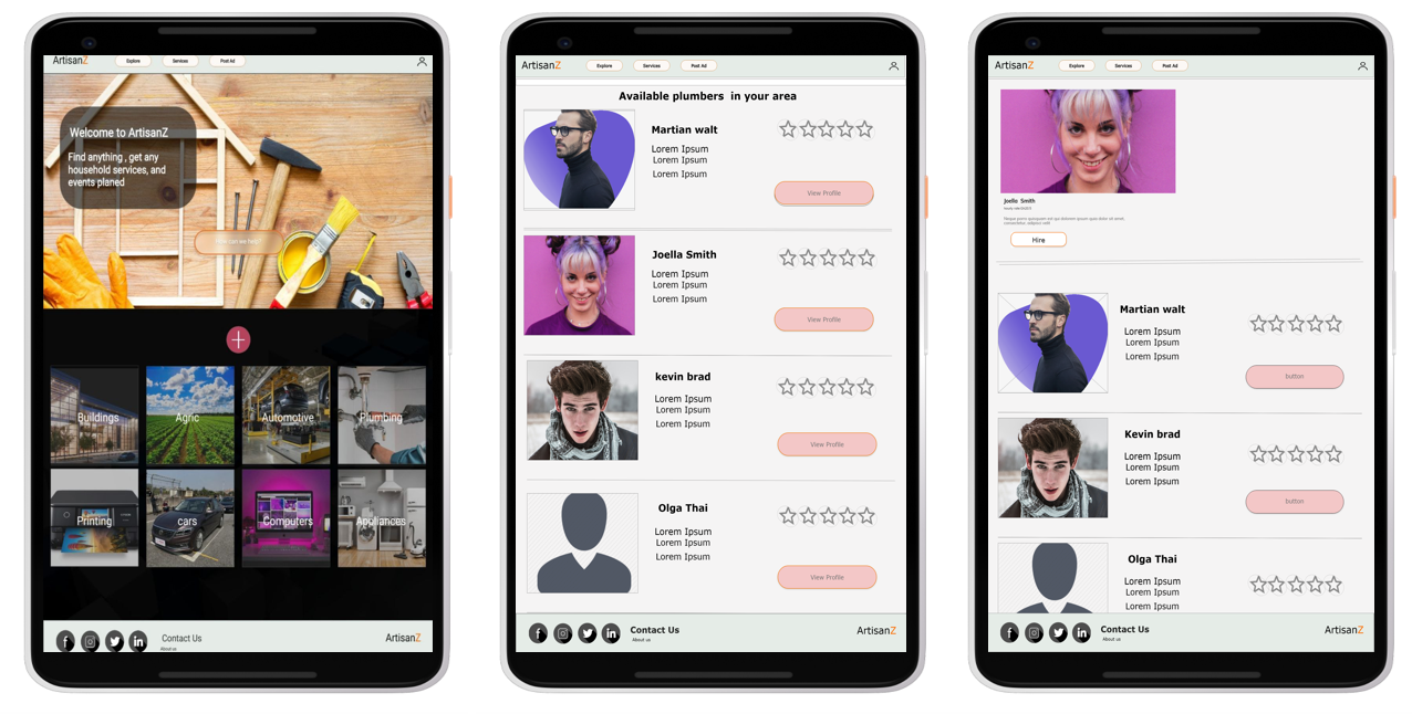
The final high-fidelity prototype presented cleaner user flows for building ordering and making payments.
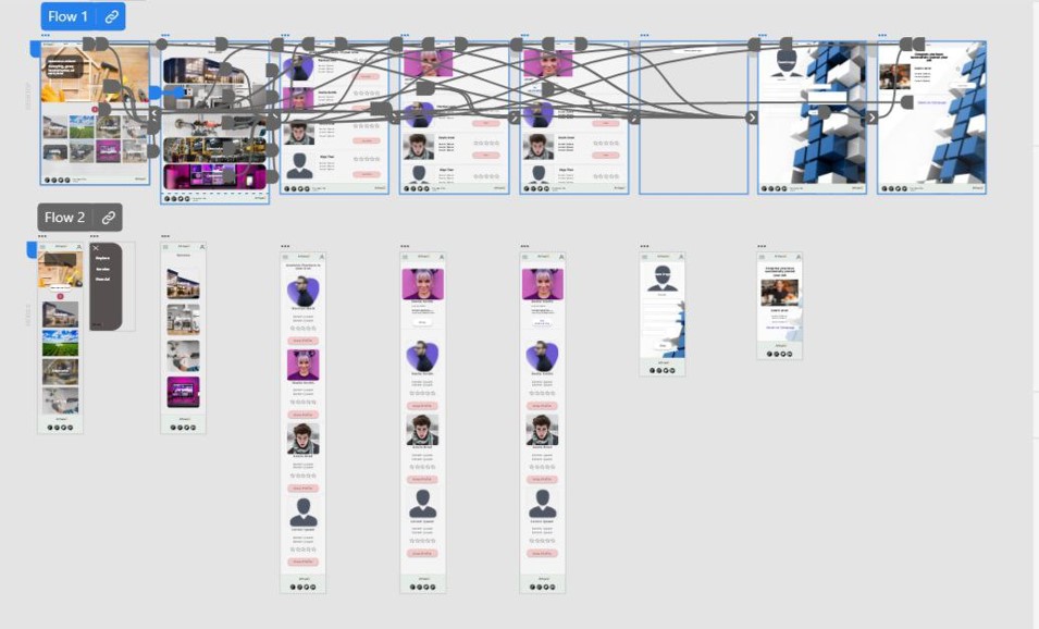
The website eases the burden of users by not having them rely on untracked and vetted referrals in order to have access
to artisan services.
One quote from peer feedback:
“chale the way I dey suffer find stove repairer, this site really dey need waa”-pidgin language.
use of alt text to images for screen readers.
use of recognizable icons