

U-TLZ is a local utility service app which carries out business mainly in the Tema Metropolitan area of Accra .U-TLZ aims at providing a medium for it’s clients to have access to a compounded and cross platform utility payment service.
Users having to pay bills due at different utility service outlets, seperately on a weekly or monthly basis
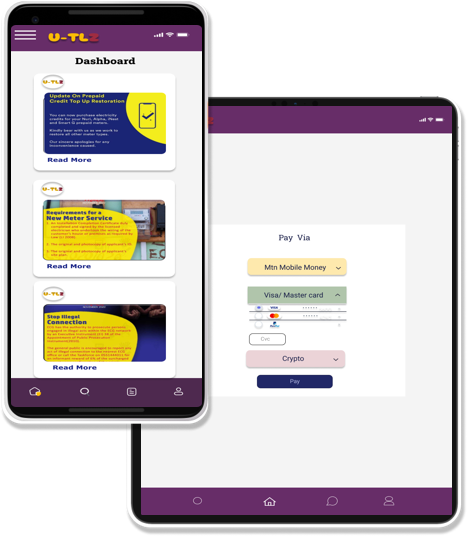
Starting off, I asked myself a few initial questions. Who is the primary user? What kind of goals do they have? Why would someone want to use this application? Just how large of a scope do I want this project to be? I conducted interviews at the initial stage of my research, created personas and a competitive analysis of the potential competitions strengths and weaknesses in order funnel out a more robust and useful service for users . A primary user group identified through research were middle aged, middle income earners with diverse backgrounds. This user group confirmed initial assumptions about U-TLZ’s customers, and their agonizing need for such a payment system.
* Paying bills easily
.
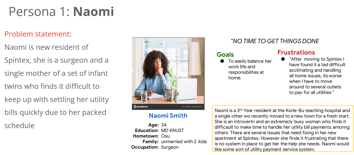
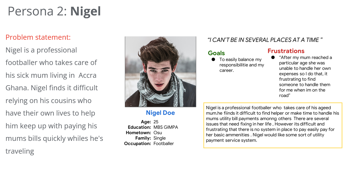
In order to construct a concise and solid foundation for U-TLZ, I had to venture out to both local and international utility service apps to see what they were already doing right as well as what user goals they were not satisfying. I evaluated several features deemed vital from user surveys and identified which ones U-TLZ could capitalize on to have a leg up over other applications. I found only two competitors which satisfied the essence and goal of U-TLZ, one, an international multiple utility payment services. and the other a municapl electricity payment service in Ghana.

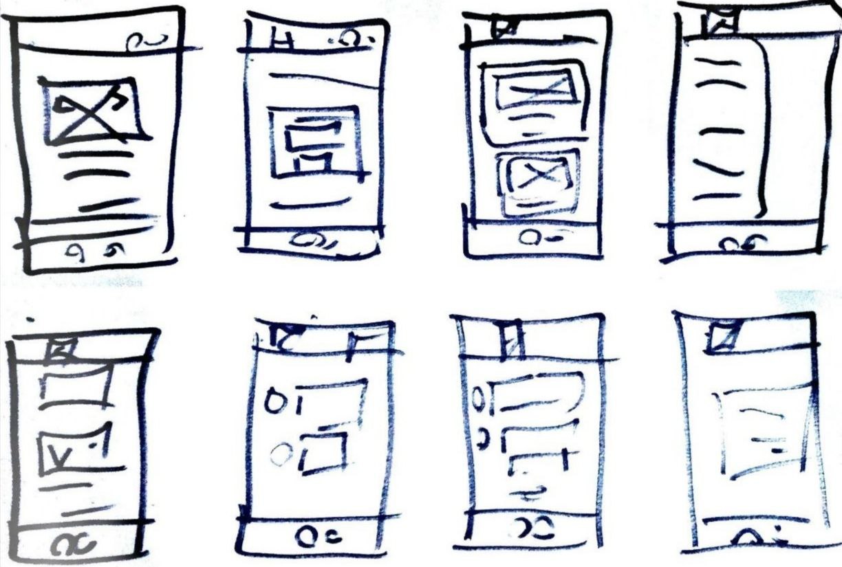
I carried out a quick ideation exercise to come up with ideas to enhance the flow and structure of the service system.Taking the time to draft iterations of each screen of the app on paper ensured that the elements that made it to digital wireframes would be well-suited to address user pain points.
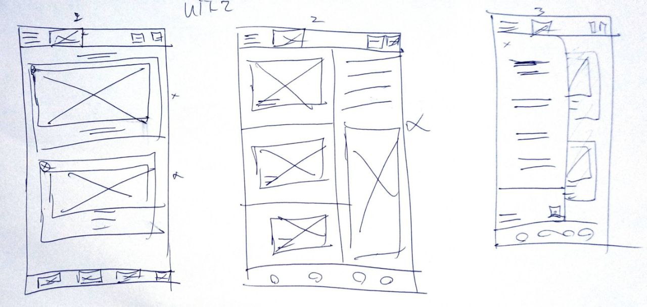
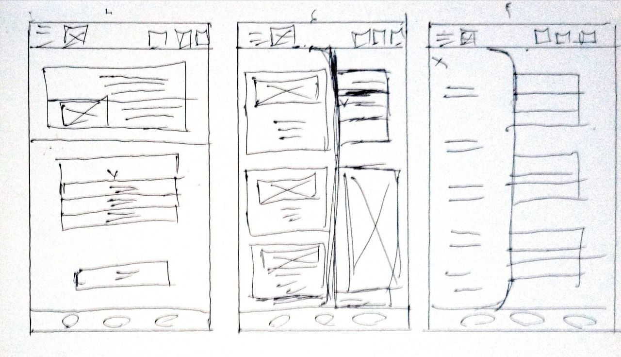
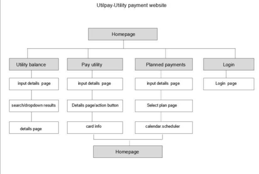
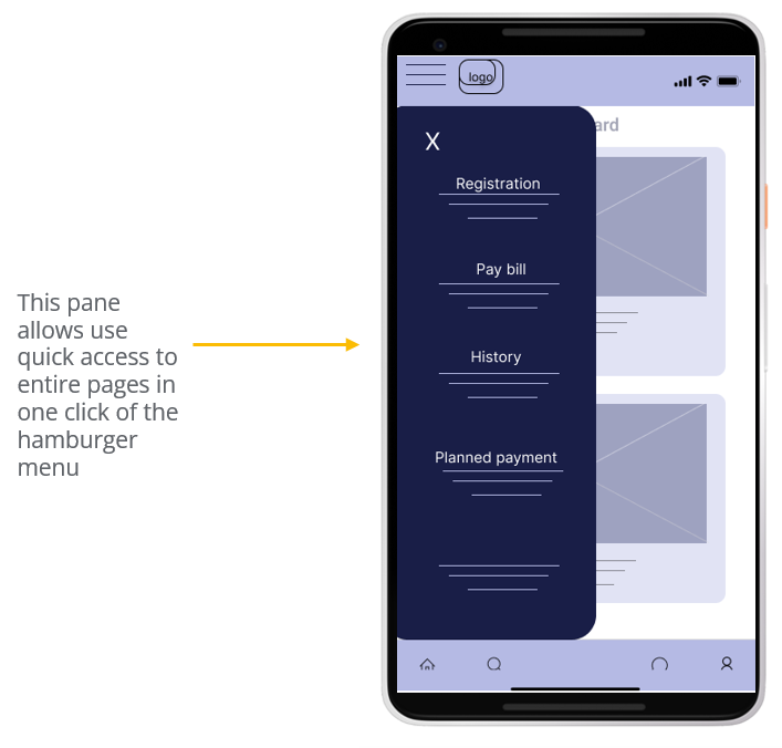
As the initial design phase continued, I made sure to base screen designs on feedback and findings from the user research as well as insights from user journey maps. I further included responsive design variations since research revealed that the particular geographical area and demographic the application was tailored for would require the addition of a desktop design.
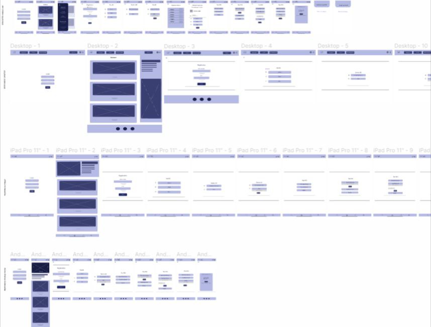
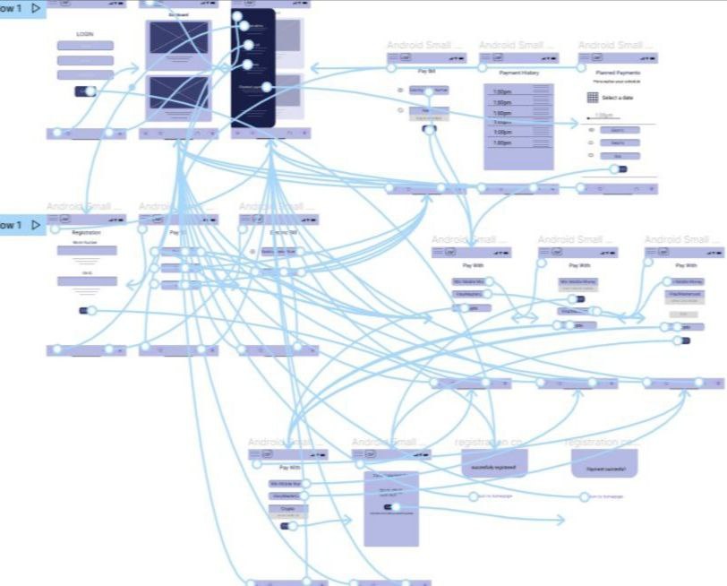
I conducted an unmoderated usability study which involved 6 participants who tested how easy it was to interact with the flow of the above wireframes as well as help guide the designs transition for mere wireframes to mockups. The finding from the usability studies were:
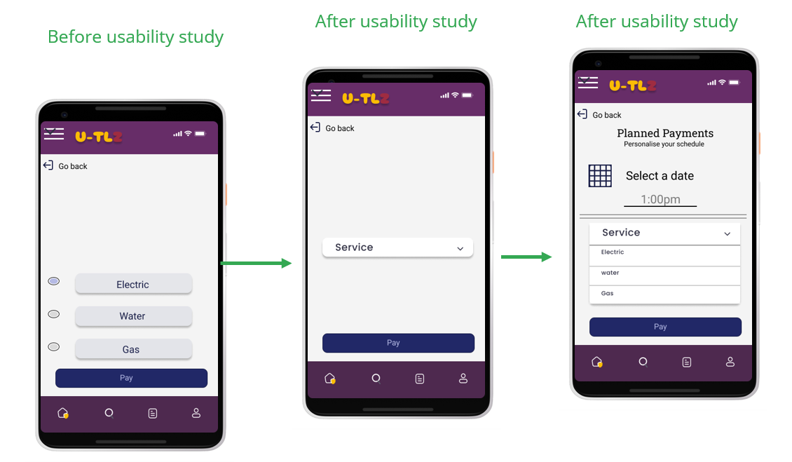
*users need a separate scheduling page to be able to make planned monthly payments
*users need a payment confirmation page displaying the sum total of bills selected to be paid
*users need more navigation buttons properly placed within the app
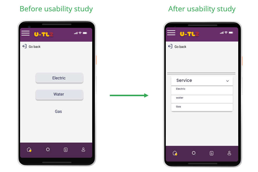
*Users need a more coherent mode of choosing services.
The usability study revealed frustration with the incoherent nature of choosing a service. The addition of a dropdown menu displaying the services solved this.
The study also revealed frustrations with the planned payment options flow, to streamline this flow, I included another page with a dropdown menu to displaying each available service.
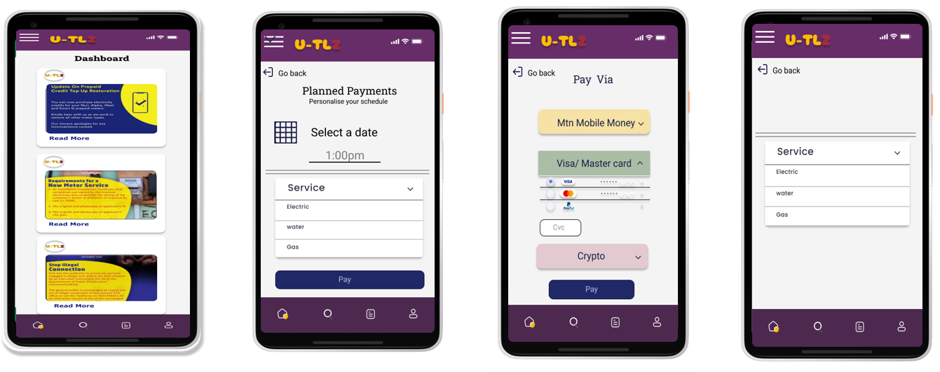
The final high-fidelity prototype presented cleaner user flows for making payments.
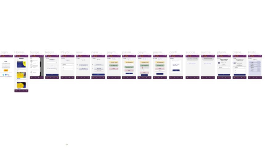
From feedback the application extremely reduces one of the major stresses of everday living for users.
use of alt text to images for screen readers.
use of recognizable icons